Trendy topics during lockdown: Netflix and chill or dream of escape ?
An ADA project by the DataMinors
| The project |
|---|
| Our team |
Introduction
Spring 2020 was marked by a series of exceptional containment measures due to the Covid-19 pandemic. These have disrupted the daily lives of billions of citizens. The measures taken have been more or less strict from one country to another.
We wanted to better understand the causes and consequences of such measures.
More specifically, in the following data story, we will discuss the different levels of stringency of the measures put in place, looking at a possible link with the level of democracy of the countries. Then we will see that there may be a link between the level of stringency of the measures put in place and the evolution of people’s interests.
We will thus answer the following questions:
Did the most democratic countries implement the most moderate measures?
Did citizens exposed to stricter measures think more about what they were not allowed to do?
To perform such analysis, we used three different types of data:
- Democracy index records
- Mobility data from Google and Apple
- Pageviews data from different versions of Wikipedia
Presentation of the democracy index
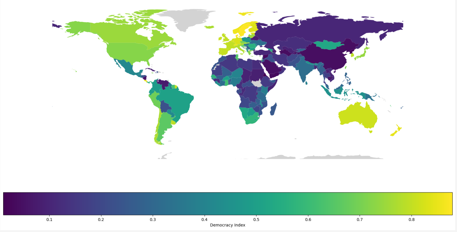
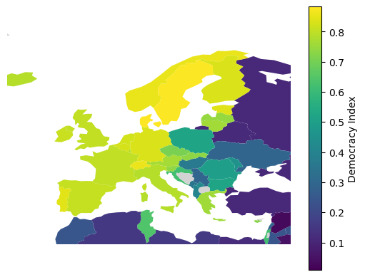
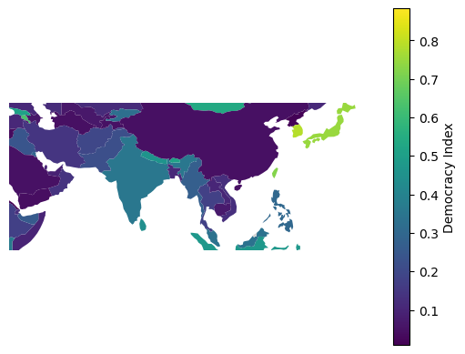
The first step is going to be to start exploring the democracy index around the world, in order to do this, the liberal democracy indicator from ‘Our world in Data’ was used. Based on the expert assessments and index by the V-Dem Institute. It combines information on voting rights, the freedom and fairness of elections, freedoms of association and expression, civil liberties, and executive constraints. It ranges from 0 to 1 (most democratic), and gives data with a variable time span from 1789 until 2021.
Using the geopandas documentation, The democracy index for the year 2020 were plotted, and displayed here the world map, with a certain zoom to the region that are going to be of interest for the remaining of the study.
I want to see specific details for
Mobility data
The covid pandemics impacted our mobility in an unprecedented way. In a vast majority of countries, people almost stopped going outside and spent the majority of their time at home, because they were forced to, because of the fear of the virus, because of the closure of the shops or because of a combination of these factors. Of course, not all countries reacted in the same way to the pandemics. Some countries showed only a small decrease in the mobility of the inhabitants while some others completely stopped all social activity. France, Mexico and Vietnam are a good examples of different reactions to the pandemics. Located on different continents, more or less democratic, the evolution in the walking mobility between these three countries is sensibly different as shown in the graph below.
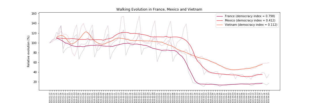
France and Mexico show a sharp decrease in walking mobility, which reaches a very low level in France. On the contrary in Vietnam, the mobility decreases much more slowly, and, then stays at a higher level than in the two other countries.
Even if the response of the authorities were similar in these countries, with the suspension of non essential activities, interdiction of meetings etc… , these measures have probably been applied in a more or less strict way. Moreover, the response of the population is non uniform across the different countries, leading to very different evolutions of mobilities.
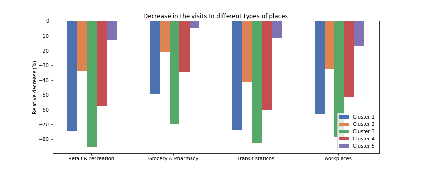
The mobility variations can also be studied more precisely, taking into account the different categories of places that people visited. In this section we focus more precisely on the categories “retail and recreation”, “grocery and pharmacy”, “transit stations” and “workplaces” which are extracted from the Google mobility data. The drop in each of these categories can be evaluated by taking the difference between the two “lowest” weeks (which corresponds to the peak of the covid pandemics in the concerned country) and the two “highest” weeks (before the pandemics). By doing this, the response to the pandemics from each country can be characterized by the drop in the visits to the different categories of places in the corresponding country.
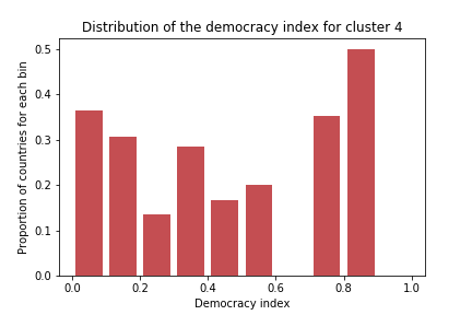
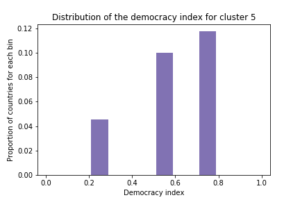
The different countries can then be clusterized with k-means to group countries with a similar response to pandemics. The mobility changes for the centroid of each cluster are depicted below :
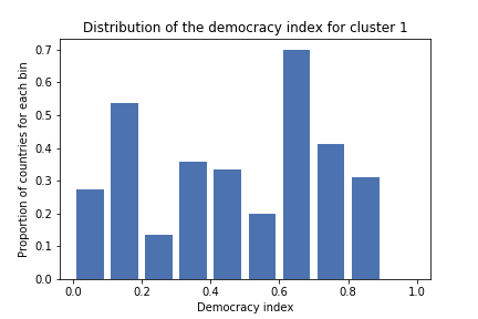
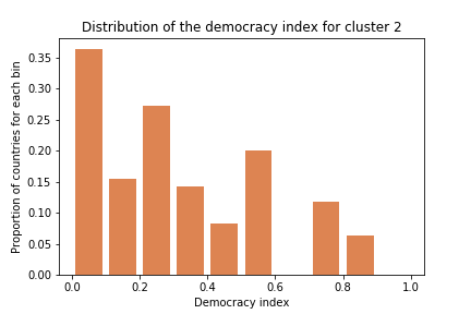
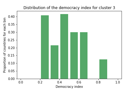
Is there a link between the stricness of the lockdown and the democracy index ?
As studied in the previous clustering, the democracy index seems to have an impact on the response of a country to the pandemics. Let us investigate more on this possible link. Using the data coming from the Apple mobility report, one can plot the decrease in walking mobility with respect to the democracy index, each point representing a country. The drop in walking mobility is evaluated by comparing the two highest weeks before lockdown vs. the two lowest weeks (i.e. the peak of the restrictions).
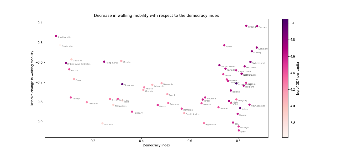
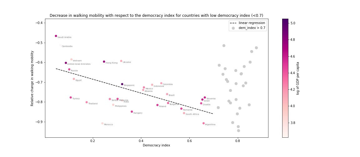
A decreasing trend can clearly be observed for countries with a democracy index lower to 0.7. Let us take into account only these countries, and study the relation between walking mobility change and democracy index using a linear regression.
The R-squared value being 0.385 , the democracy index explains an important part of the variance observed in the walking mobility change, for countries with a relatively low democracy index. The coefficients indicate that in the range of democracy index [0, 0.7], the walking mobility decreases by 3.5% each time the democracy index is increased by 0.1. There is thus a clear link between democracy index and the strength of the restrictions, but this link is much less obvious when the democratic countries are also considered.
One possible explanation of this phenomena could be the association between the democracy index and the wealth of the countries. One can visualize the democracy index as a functin of the GDP per capita on the graph below :
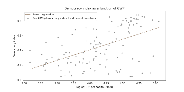
The linear regression indicates that the richest the country, the more democratic it is and probably the higher is its capacity to enforce constraining measures without too important impact on the poverty of its population. However this does not apply for very rich and democratic countries. One possible explanation for this is that developped countries have a powerful health system which allows them to have lighter restrictions without a too strong impact on the health of their population.
Hence there is a clear correlation between the democracy index and the response to pandemics. The restrictions were lighter in undemocratic countries while one might have thought that authoritarian regimes would have enforced the strictest restrictions. It appears in fact that the reason behind this lies in the wealth of the studied countries. Undemocratic country cannot inforce high restrictions without increasing poverty which could compromise their regime. More democratic countries are more willing to impose stric restrictions as they are less constrained from an eonomic point of view. Finallyn, very democratic countries are also the richests : they have all lattitude to impose the measures they want as they are rich enough, and also probably better medical infrastructure which necessitate less restrictions to contain the effects of the virus.
Wiki dataset presentation
The objective of this section is to study the impact of the COVID-19 pandemic on the population’s interests, taking into account the different level of mobility shift in each country. Only 12 countries are considered here, which are Turkey, Serbia, Japan, Italy, South Korea, Catalonia, the Netherlands, Germany, Finland, Norway, Sweden and Denmark. These are the only versions of Wikipedia present in the dataset whose language can be directly associated with a single country. This was not the case for the English version of Wikipedia, for example, as English is spoken in many parts of the world.
Using the following drop-down menu it is possible to visualize the evolution of the total number of wikipedia searches for these countries. On the time scale the date of the drastic drop in mobility is depicted. The period that will be considered as the ‘COVID’ period for the rest of the analysis starts with this date and ends with the date of return to normalcy available in the dataset. The average evolution across all countries is also available, the population of each country is taken as a weight in the average calculation.
Plese select a country to display the details :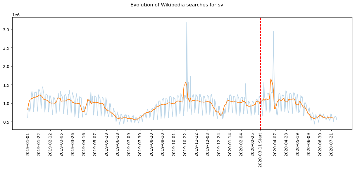
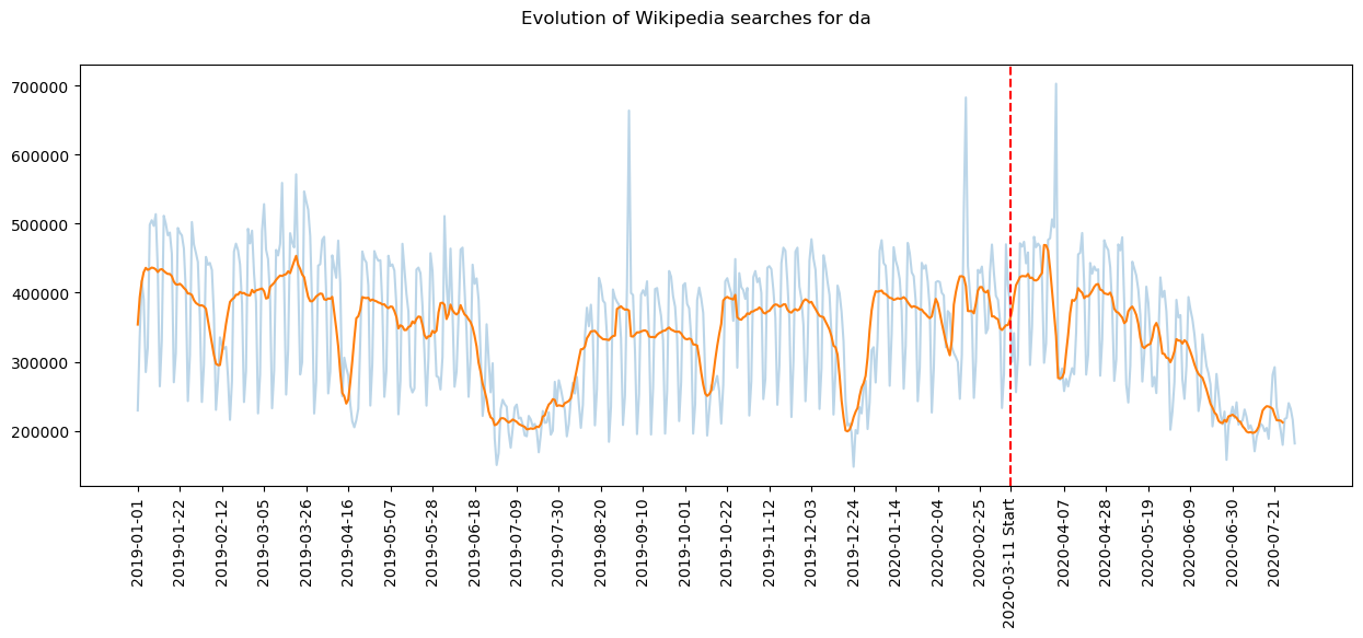
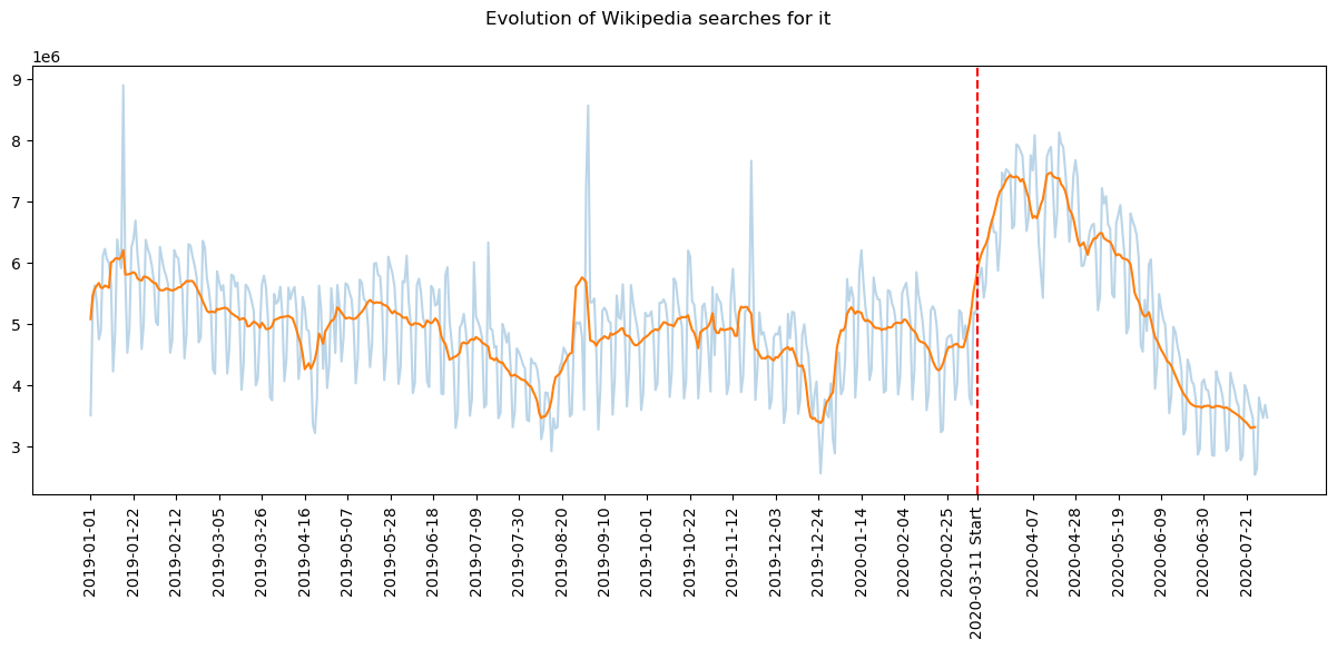
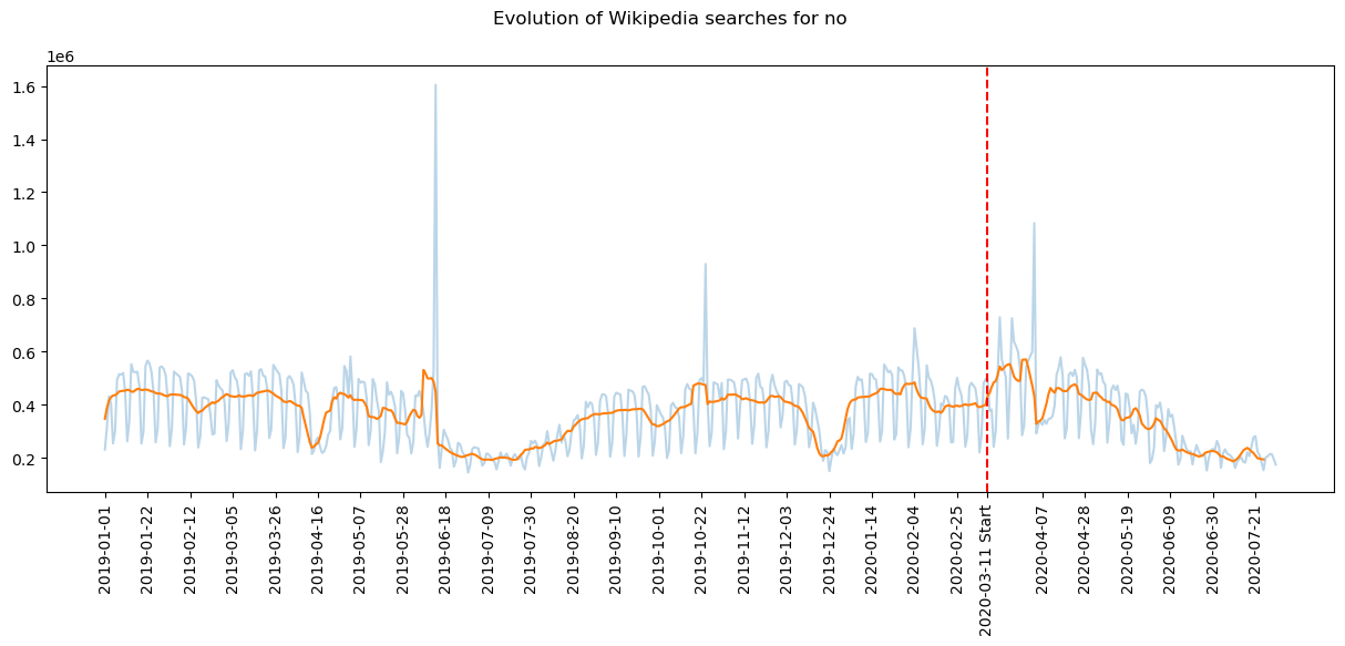
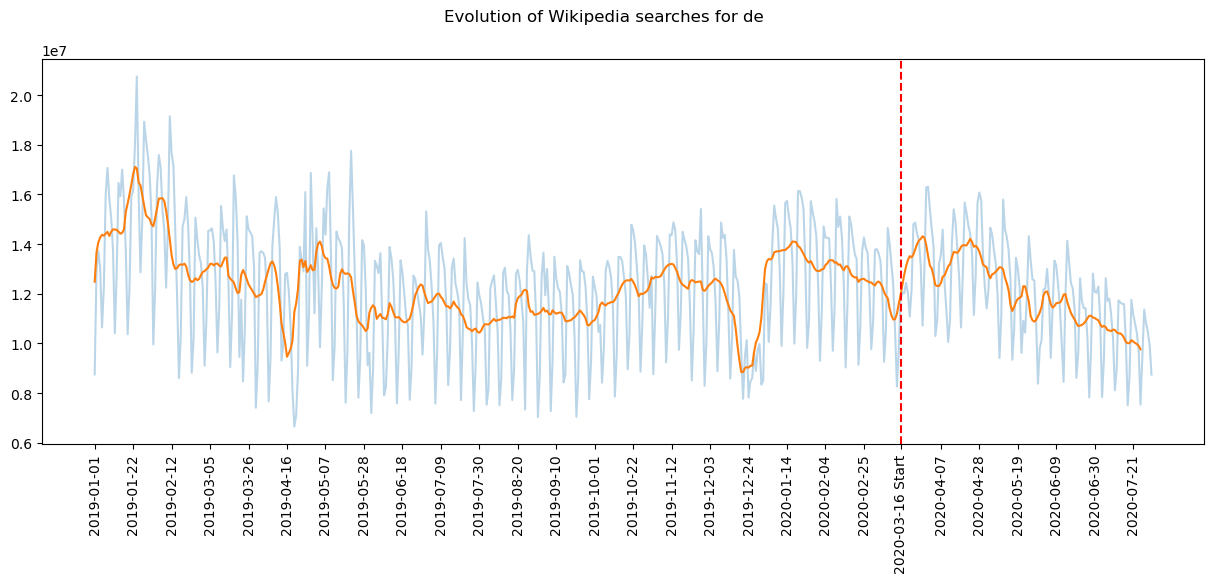
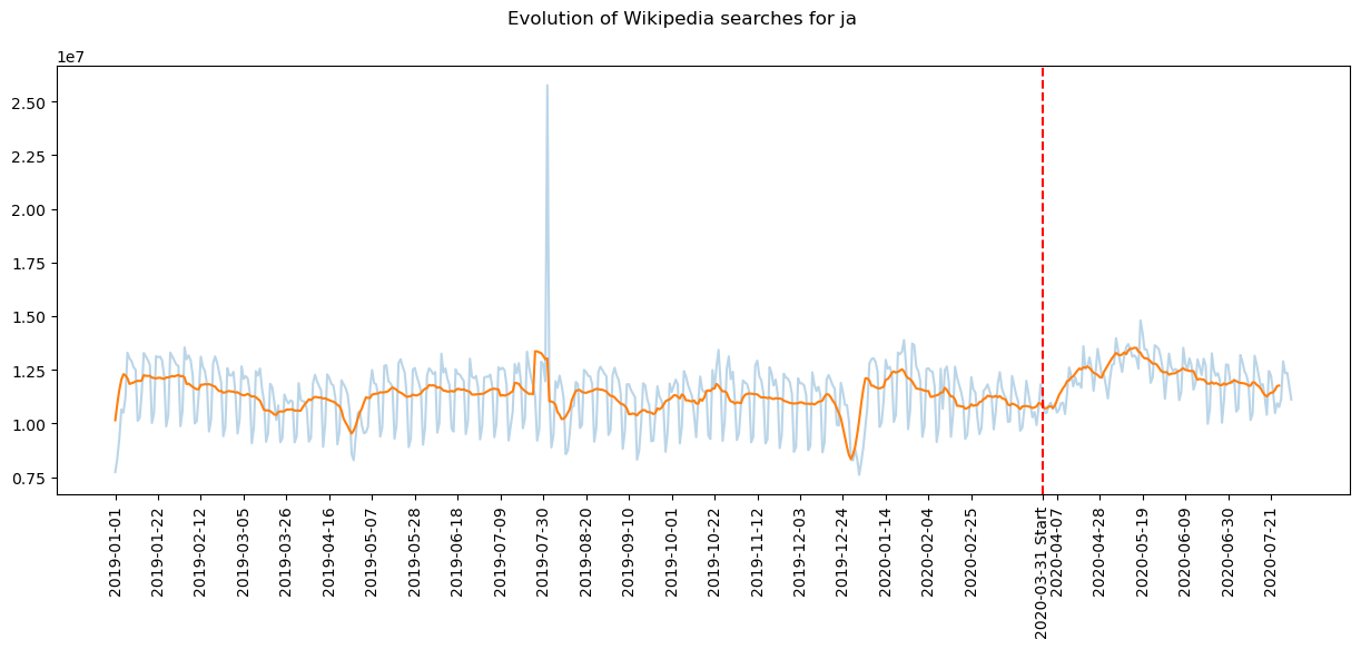
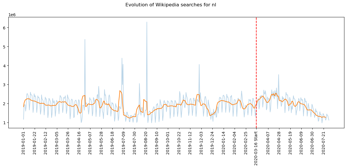
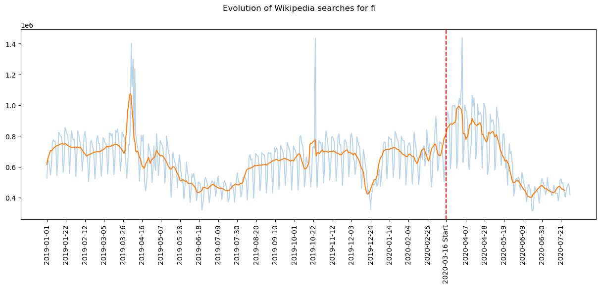
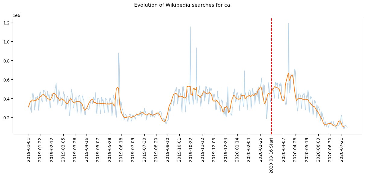
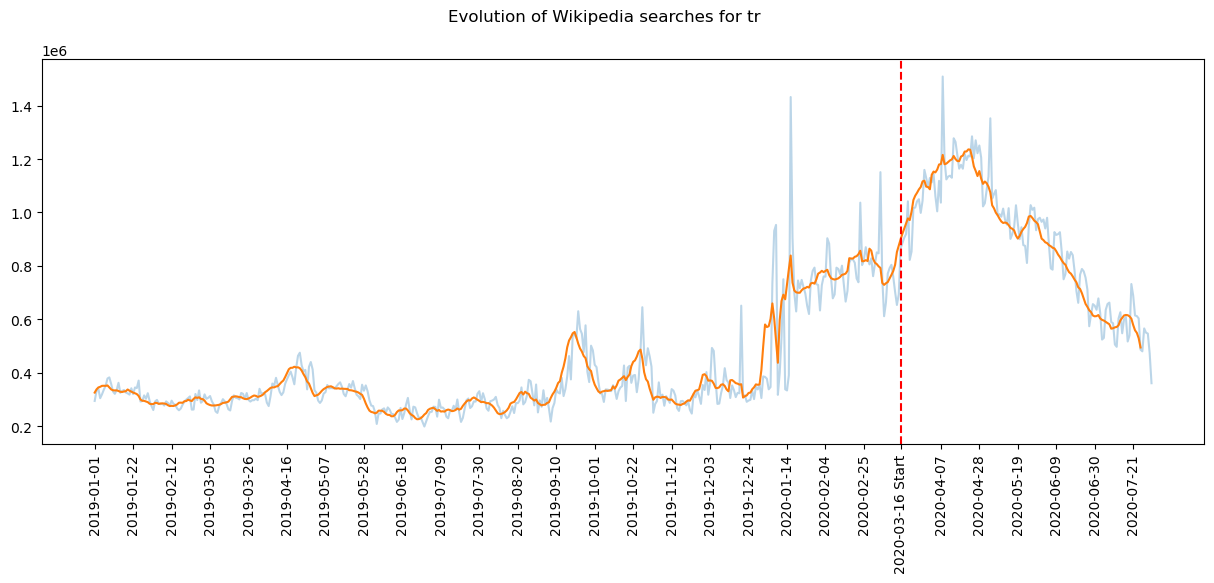
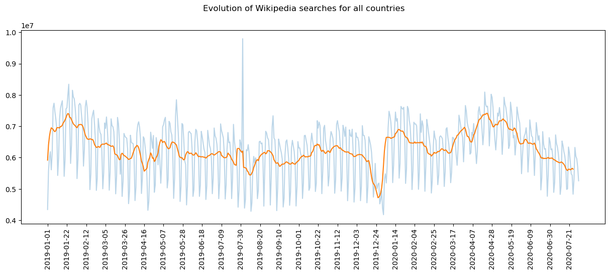
The transparent curve shows the weekly periodicity of the number of searches, with a peak of activity on the weekend. This trend is not relevant in this analysis, hence the interest of the one week moving average with the orange curve. It can be noticed that in most cases the total traffic of wikipedia has not been so much impacted by the pandemic. This is however the case for Turkey and Italy which are two countries where the drop in mobility has been very important. Nevertheless, even if the total number of visits is relatively stable, it is relevant to look at the breakdown of these searches by topics, in order to know the emerging and declining topics
In order to do so, the following figure shows the relative evolution of interest in several topics and in each country considered here. The relative evolution of interest for a given topic in a given country is defined as follows:
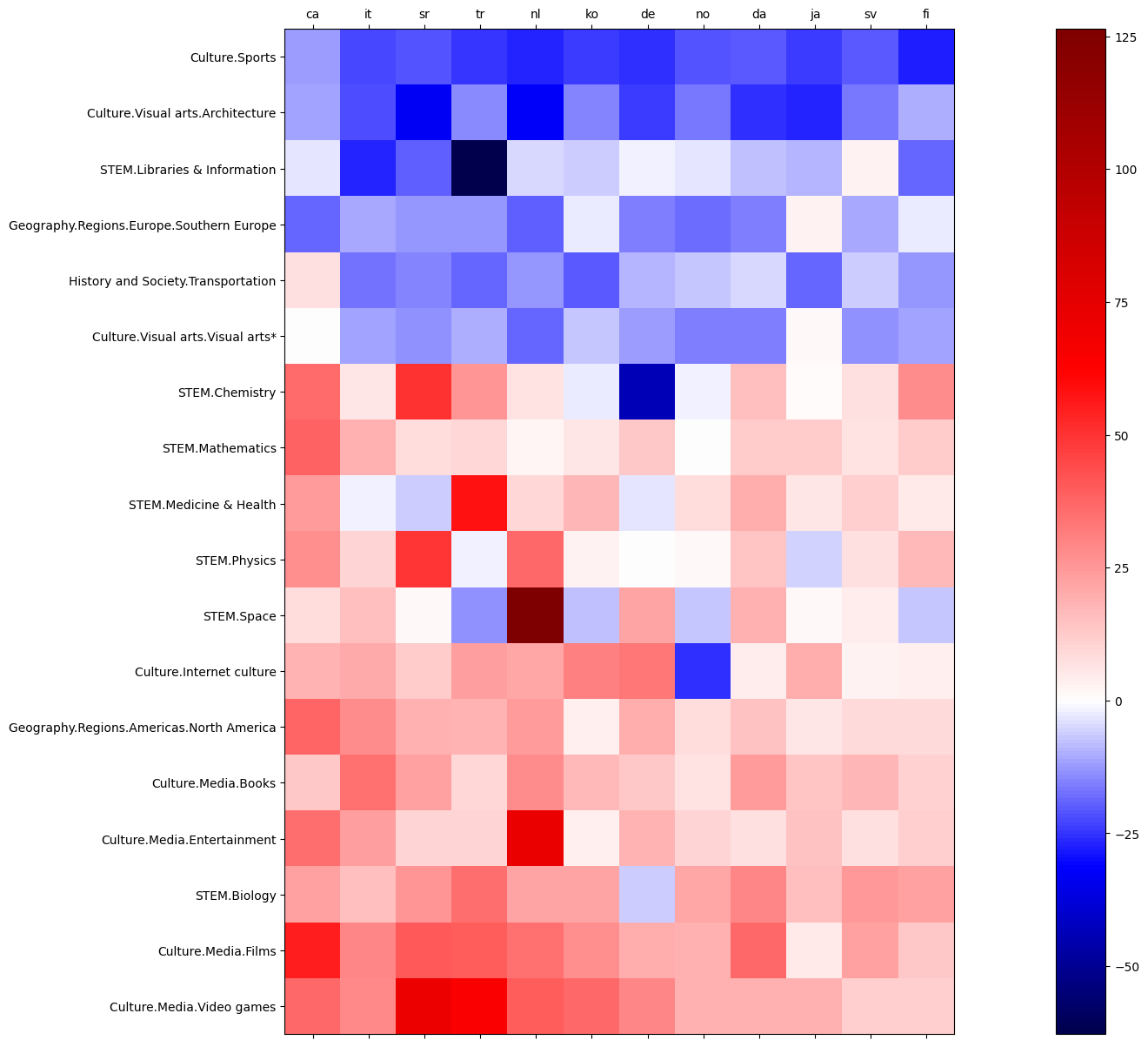
On the vertical axis the matrix is sorted with the subject whose interest has globally decreased the most at the top and the subject whose interest has globally increased the most at the bottom. On the horizontal axis, countries are sorted according to their mobility shift, from highest on the left to lowest on the right. Moreover, only those topics that have a relative change in interest of more than 10% in absolute value (on average over all countries) are shown.
The subject in which interest decreased the most during the COVID was sport. This decline in interest in sport is almost uniform (approximately -20%) across the 12 countries considered, although they have different mobility shift values. Even in countries where mobility has decreased less, such as Finland or Sweden, interest in sport has decreased significantly. There was also a decline in interest in other subjects such as architecture, visual arts and transportation, which can be explained by the almost complete cessation of tourism and reduction of travel. Again, these decreased values do not seem to be correlated with either the democracy index or the mobility shift.
Among the 10 subjects that have gained the most interest overall among the population are video games, films, books, entertainment and internet culture. This can be explained quite easily by the fact that people have been looking for new occupations to occupy the large amount of free time spent at home. ‘biology’ and ‘medicine and health’ have also gained a lot of interest, probably due to the public concern and need for information about COVID-19. Here the color gradient seems to indicate a relationship between the level of decline in mobility and the gain in interest for certain subjects, which can checked with the next figure.
Each point of the next figure represents a version of wikipedia, with the mobility shift in the associated country on the x-axis and the gain in interest in films and video games on the y-axis (weighted average of the two subjects).
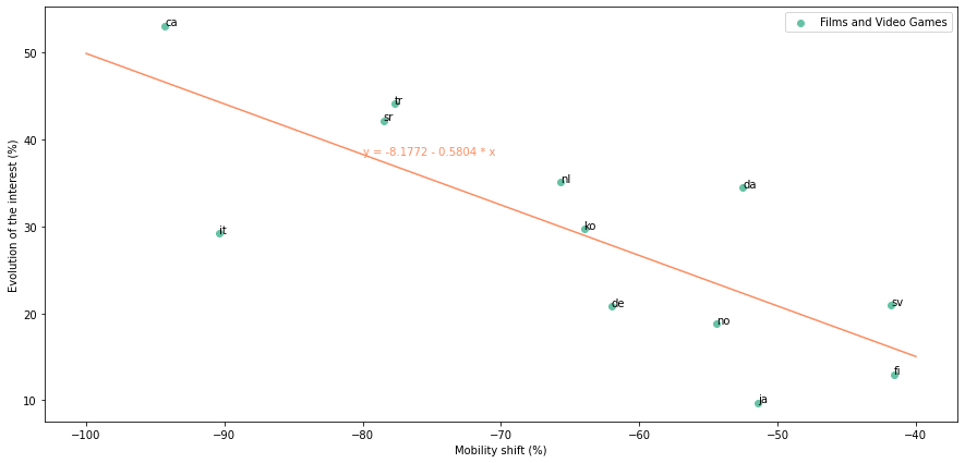
There appears to be a linear relationship between the two variables, with a correlation coefficient of 0.599 which shows that the mobility shift is one of the main driver for the evolution of the interest in video games and films. The coefficients of the line are made explicit in the graph. The slope is about 0.6, which means that a 10-point decrease in mobility leads to a 6-point increase in interest in video games and films.
From an overall perspective, it is possible to conclude that the populations of the countries studied appear to have complied with the containment and health measures imposed by governments. Indeed, people did not seek to take an interest in what was forbidden and inaccessible but rather in the only occupations that remained possible. This analysis goes in the direction of a capacity of the population to adapt to the situation and seems to indicate that the extremist protest movements were perhaps over-represented on the social networks or in the media compared to their real extent in the society.
Conclusion
Our study allowed to better understand mobility restriction policies implemented during the Covid-19 pandemic and their consequences.
First, it appeared that, except for the highly democratic countries, the less democratic the countries are the less mobility of citizens has been reduced. A reason for that observation could be found in the variations of GDP per capita, that can act as a confounder. Poorer countries, which are also less democratic in average, cannot afford the loss of economic revenue that accompanies mobility restrictions.
Different clusters of countries distinguished according to the mobility decrease in different places, usually matching specific levels of liberal democracy index.
To better understand the consequences of these more or less strict restrictions, we then studied the changes in the interests of citizens subject to different restrictions. It appeared that the more restrictions citizens were subjected to, the more their interest in the only topics that were still accessible to them (such as films and series) increased.
Thus, under restrictions, people seem to adopt a behaviour in line with their environment (e.g. Netflix and chill) rather than draming about what is not accessible (e.g. sports, tourism).